R PROJECT : How to increase the profit of Shoe Shop?
1 Introduction
It's my first project, where our instructor gave me a dataset of 'XYZ' shoe company. This company's sale have been decreasing since 2018, and they want to figure out what kind of factors positively affect to sale and what kind factors on the other hand, decrease company's profit.
2 Loading and Exploring Data
2.1 Loading libraries required and reading the data into R
Loading R packages used besides base R.
library(DT)
library(dplyr)
library(lubridate)
library(ggplot2)
library(reshape2)
library(lubridate)
library(rpart)
library(DMwR)
library(rpart.plot)
df<-read.csv('C://Users/dyerl/Documents/table.csv', stringsAsFactors = F)
df$Date <- mdy(df$Date)
df$year <- year(df$Date)
df$month <- month(df$Date)
df$day <- day(df$Date)
df$weekday <- weekdays(df$Date)
options(scipen=100000)
dim(df)
str(df[,c(-10:-1)])
m<-sapply(df, function(x)sum(is.na(x)))
m
df$Cost.of.sales <- ifelse(is.na(df$Cost.of.sales), mean(df$Cost.of.sales, na.rm=TRUE), df$Cost.of.sales)
df<-df%>%mutate(Profit = Fact..KZT..with.discount.- Cost.of.sales)
tail(df$Cost.of.sales, 10)
Reading the table.csv. Also, I found that date stored as a string and I converted it to date format by using 'datetime', and disabled scientific notation. This date frame has 809 rows and 11 columns.

By viewing the type of data in each column, I check the number of 'NA'. I have only one 'NA' in 'Cost of sales' column, therefore I found a mean of the 'Cost of sales' column and replaced with it. Because, 'NA' is located on the last day(row) of sale and they didn't finished to record that data. Then I mutated a new column 'Profit' which equals to the 'Fact..KZT..with.discount.- 'Cost.of.sales'.
 Last 10 rows of ‘Cost.of.sale’ column, and ‘NA’ have been replaced by 604679.7.
2.2 Now, We compare the Planned profit with actual profit
We will group by year and compare the company's planned profit with actual profit.
  df_year <- df%>% group_by(year)%>%summarize(meanProfit=mean(Profit), total=sum(Profit), planProfit= sum(Plan..KZT), difference = planProfit-total)
  datatable(df_year)
  options(scipen=100000)
  mydata <- data.frame(Real_with_discount=df_year$total, Predicted=df_year$planProfit)
  barplot(as.matrix(mydata), main="Real & Predicted income", ylab="Total", beside=TRUE,
          col=terrain.colors(3))
  legend("topright", c("2016", "2017","2018"), col=terrain.colors(3), lwd=15);

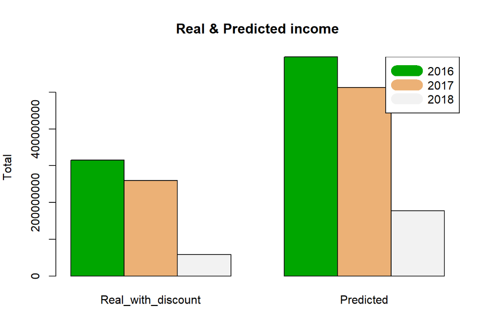
We can see that company's profit didn't reached the planned income rate.
2.3 Traffic of clients visualization
df1<-df%>%group_by(year)%>%summarize(meanTraffic=mean(Traffic))
ggplot(data=df1, aes(year, meanTraffic))+geom_line()+geom_point()
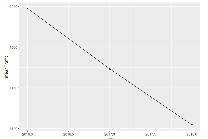
The traffic of clients is also declined from 2016-2018.
2.4 Seasonality
Let's check factor month, weekday. Maybe, having low income due to seasonality?
df_sale_month <- df%>%group_by(month)%>%summarize(meanProfitMonth = mean(Profit),meanTrafficM = mean(Traffic),meanCustomerM = mean(Receipt..customers.))
df_sale_month
ggplot(data=df_sale_month, aes(factor(month), meanProfitMonth, fill=meanProfitMonth))+
  geom_bar(stat="identity")

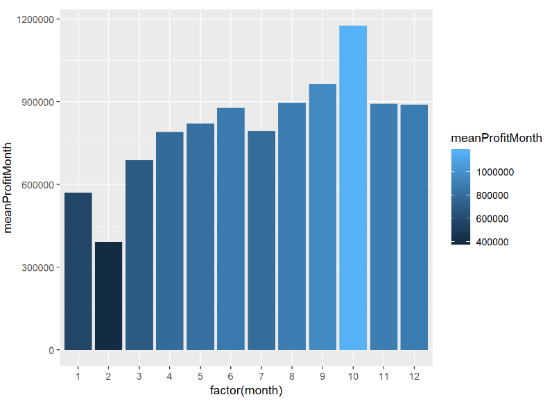
As a result, the most high selling month is October, the lowest is February.
So, let's try to look at profit for every season.
df_sale_season <- df%>%mutate(Season = ifelse(month<=2|month==12, 'Winter', ifelse(month>=3&month<=5, 'Spring',ifelse(month>=6&month<=8, 'Summer','Fall'))))
df_season <- df_sale_season%>%group_by(Season)%>%summarize(meanP = mean(Profit),meanTr = mean(Traffic))
df_season
library(ggplot2)
ggplot(data=df_season, aes(Season,meanP))+
 geom_bar(stat="identity",fill = '#1E90FF', color ='#00008B')+
  ggtitle('Season histogram') +
  ylab('mean Profit for 2016-2017') +
  xlab('Season')

So, here we see an interesting correlation that even though, the mean traffic(clients number) is higher during 'Summer', the profit is lower that the autumn. Hence, the mean check per client during autumn is higher. It's maybe because people buy winter shoes during autumn and they cost much higher or during autumn there was a big sale on summer shoes. So, probably, we need more data about what kind of shoes sold the most.
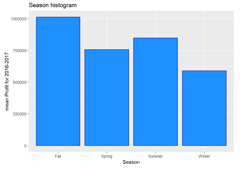
The highest profit in Fall, and high traffic during Summer.
2.5 So, now let’s check, how does weekday factor affect to the profit?
df_sale_max_days<-df%>%group_by(weekday)%>%summarize(meanProfit = mean(Profit), meanCustomer=mean(Traffic))
ggplot(data=df_sale_max_days, aes(weekday, meanProfit, fill=meanProfit, binwidth = 1))+
  geom_bar(stat="identity")
ggplot(data=df_sale_max_days, aes(weekday, meanCustomer, fill=meanCustomer, binwidth = 1))+
  geom_bar(stat="identity")
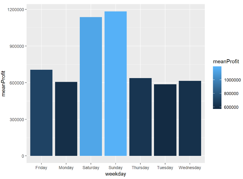
The highest mean profit during weekends and the lowest mean sale were during Tuesday.
2.6 How does weekday factor affect to the traffic of the clients?
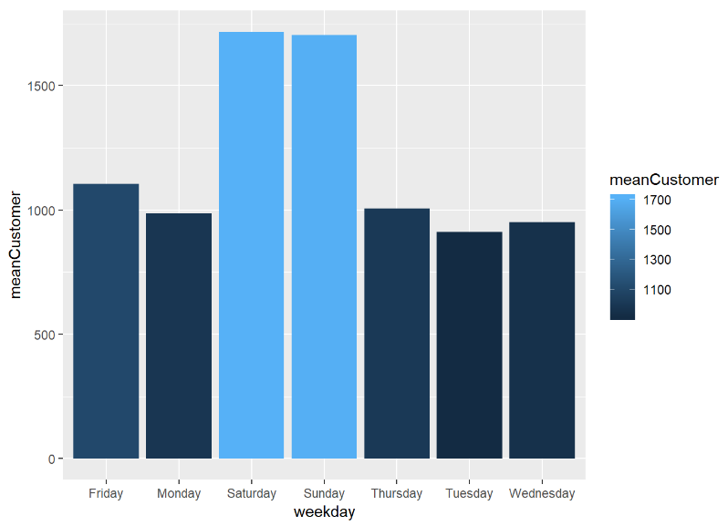
The highest mean traffic of clients during weekends and the lowest mean traffic of clients were during Tuesday.
In conclusion, the highest sale and traffic were in weekends. It means that Shop should serve more clients, and shop could decrease the amount of workers during work days and increase during weekends or increase work hours during weekends and Fridays.
2.7 Traffic of clients and Real customers
How discount affect to the traffic of clients?
df_discount<-df%>%mutate(Discount_show=ifelse(Average.discount<30,'>>30%',ifelse(Average.discount>=30&Average.discount<=50,'30%-50%', '<<50%')))
df_discount_1<-df_discount%>%group_by(Discount_show)%>%summarize(AverageTraffic= mean(Traffic), Average_customer=mean(Receipt..customers.))
ggplot(data=df, aes(Average.discount,Traffic))+
  geom_point()+
  geom_smooth()
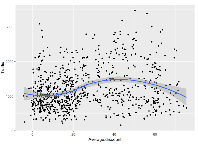
We could see that discount from 30-50% works well, and we shouldn't increase discount which over 60% .
Does more traffic bring more customers?
ggplot(data=df, aes(Traffic, Receipt..customers.))+
  geom_point()+
  geom_smooth(model=lm)
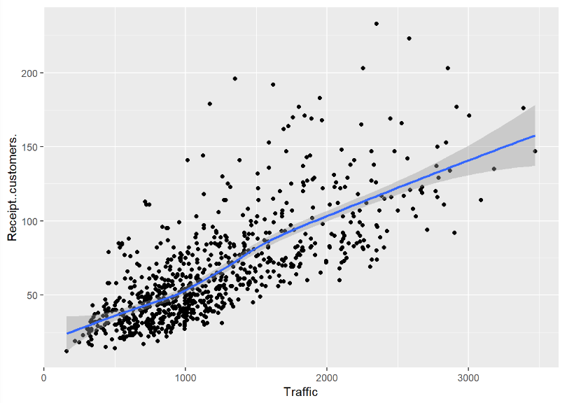
Yes more traffic = more clients
2.8 How discount changes through month and weekday? Does it affect to the profit of the month?
df_disc_month<-df%>%group_by(month)%>%summarize(meanDiscount=mean(Average.discount), meanProfit= mean(Profit))
datatable(df_disc_month)
ggplot(data=df_disc_month, aes(month, meanDiscount, fill=meanProfit))+
  geom_bar(stat='identity')
df_disc_weekday<-df%>%group_by(weekday)%>%summarize(meanDiscount=mean(Average.discount), meanProfit= mean(Profit))
datatable(df_disc_weekday)
ggplot(data=df_disc_weekday, aes(weekday, meanDiscount, fill=meanProfit))+
  geom_bar(stat='identity')
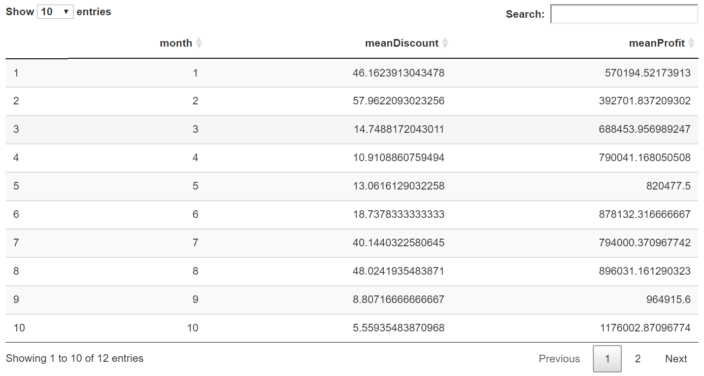
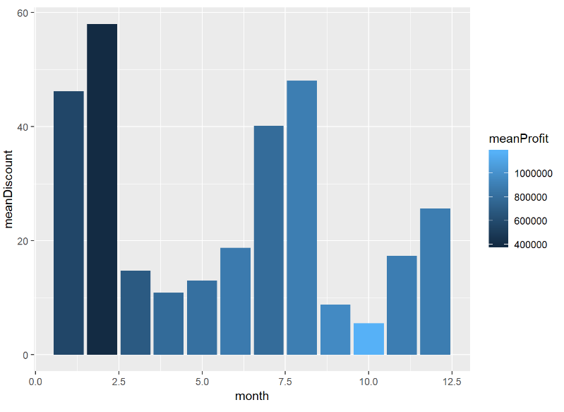
As a result, the highest profit was in October, but it has the lowest discount rate. The February with the lowest profit has the highest discount.
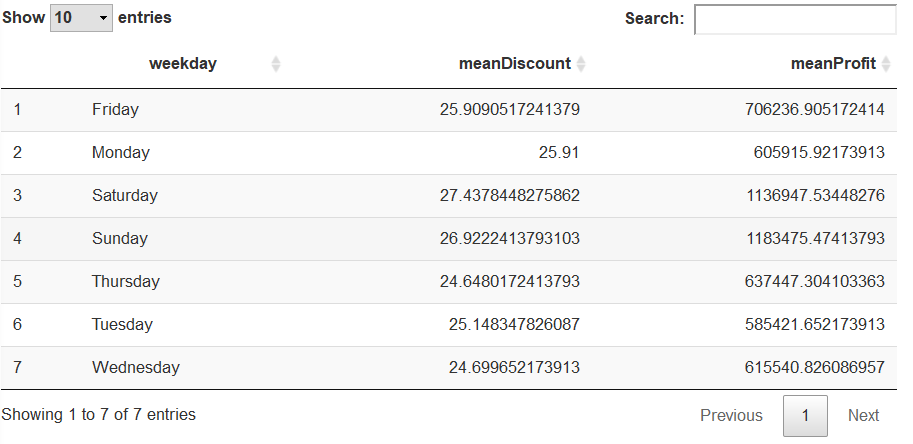
2.8 How discount changes through weekday? Does it have any effect on profit?
df_disc_weekday<-df%>%group_by(weekday)%>%summarize(meanDiscount=mean(Average.discount), meanProfit= mean(Profit))
datatable(df_disc_weekday)
ggplot(data=df_disc_weekday, aes(weekday, meanDiscount, fill=meanProfit))+
  geom_bar(stat='identity')
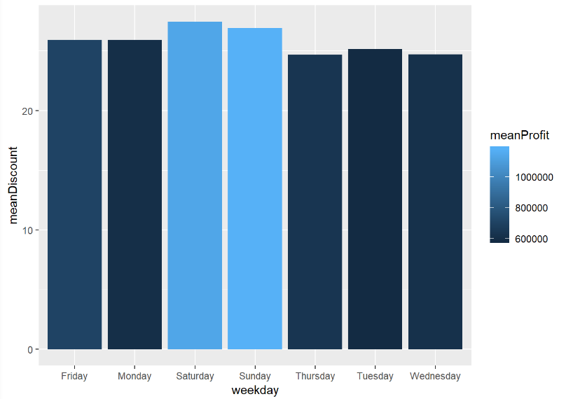
The discount approximately the same, however the profit varies.
3
3.1 How discount affects to the profit of company? Does it decrease the profit
Diff..KZT is a table change of actual profit without discount and profit with discount.
summary(df$Diff..KZT)

summary(df$Diff..KZT)


Here, we could assume that discount increases the profit of the company, because the difference between actual profit and profit with discount is negative and cutting a discount, probably would decrease the profit of the company.
3.2 Let’s now check does having a high discount, leads to a big difference between actual profit and profit with discount?
options(scipen=100000)
ggplot(data=df_discount, aes(Profit, fill= Discount_show))+
  geom_histogram()+
  geom_vline(xintercept = 3)
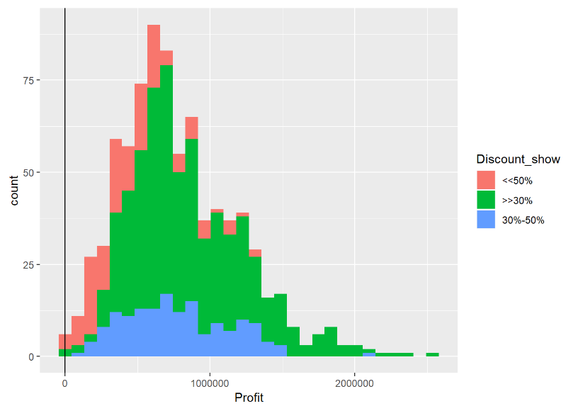
Discount didn’t cost any changes, but it's good source to make high traffic
///change
3.3 Average price of item in the Shop
How average piece price affect to the profit?
ggplot(data=df%>%filter(Average.price.piece<40000),aes(Average.price.piece, Profit, color = Average.discount))+
  geom_point()+
   geom_smooth(method='loess')
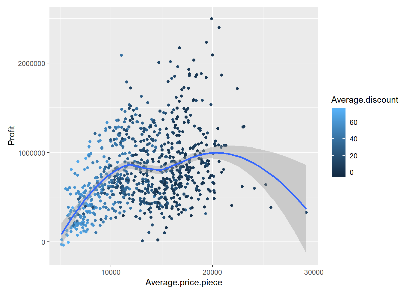
Piece to 12000-20000 affect positively to profit, but higher than 20000 negatively affect to the profit.
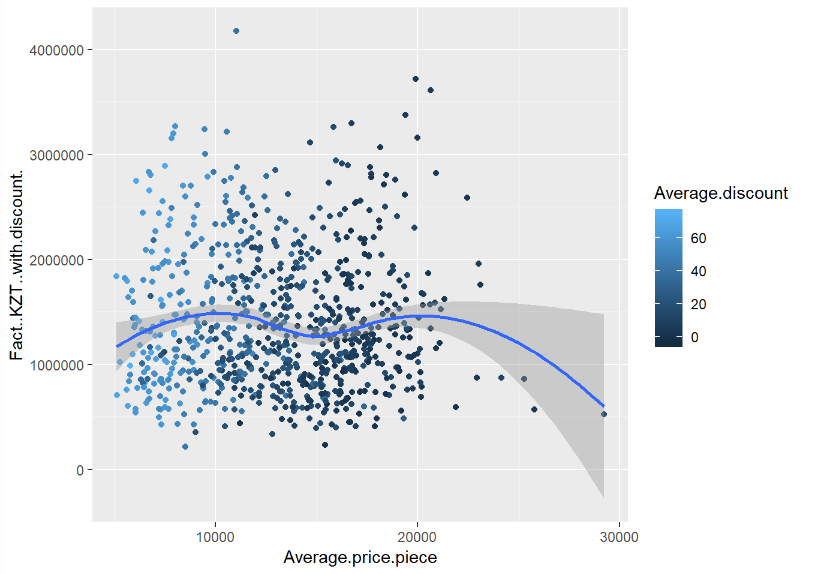
ggplot(data=df%>%filter(Average.price.piece<40000),aes(Average.price.piece, Fact..KZT..with.discount., color = Average.discount))+
  geom_point()+
   geom_smooth(method='loess')
ggplot(data=df%>%filter(Average.price.piece<40000),aes(Average.price.piece, Fact..KZT..without.discount., color = Average.discount))+
  geom_point()+
   geom_smooth(method='loess')
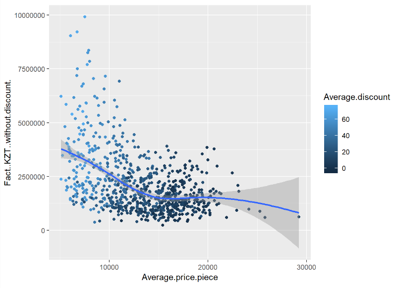
So we can made a conclusion that the profit increase, when Average piece price 0-10000, 15000-20000, profit increases. Therefore we should do discount to expensive items.
3.4 Productivity and profit
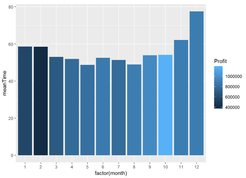
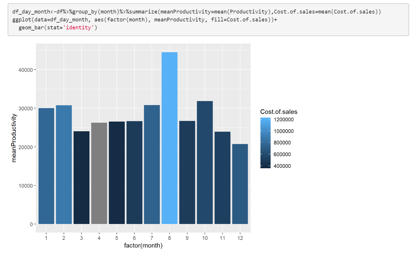
How work worktime, productivity changes through a month? Does it affect to profit?
df_day_month<-df%>%group_by(month)%>%summarize(meanTime=mean(Qty.of.hours),Profit=mean(Profit))
ggplot(data=df_day_month, aes(factor(month), meanTime, fill=Profit))+
  geom_bar(stat='identity')
df_day_month<-df%>%group_by(month)%>%summarize(meanProductivity=mean(Productivity),Cost.of.sales=mean(Cost.of.sales))
ggplot(data=df_day_month, aes(factor(month), meanProductivity, fill=Cost.of.sales))+
  geom_bar(stat='identity')
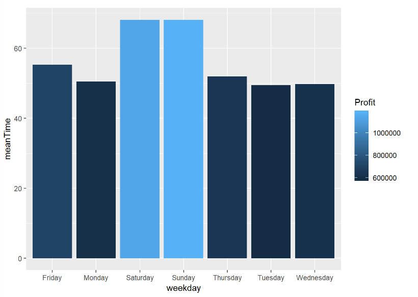
3.5 How productivity, worktime changes through weekday? Does it affect to profit?
df_day_weekday<-df%>%group_by(weekday)%>%summarize(meanTime=mean(Qty.of.hours),Profit=mean(Profit))
ggplot(data=df_day_weekday, aes(weekday,meanTime, fill=Profit))+
  geom_bar(stat='identity')
df_day_weekday<-df%>%group_by(weekday)%>%summarize(meanProductivity=mean(Productivity),Cost.of.sales=mean(Cost.of.sales))
ggplot(data=df_day_weekday, aes(weekday, meanProductivity, fill=Cost.of.sales))+
  geom_bar(stat='identity')
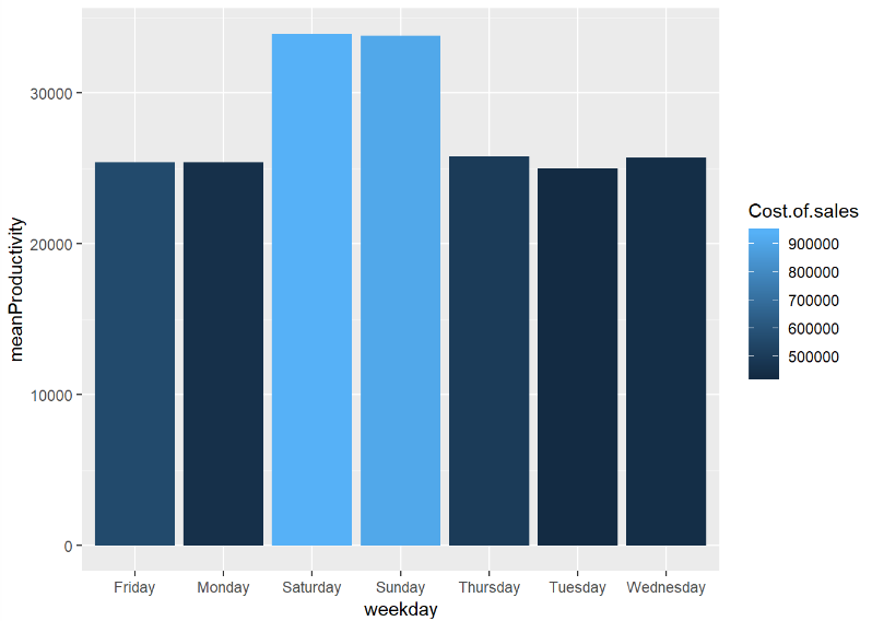
So we can made a conclusion that productivity doesn’t so much affect to the profit, but it rises cost of sales, which means helps to serve more customers.
Analysis of factors
How discount affect to the other measures?
library(rpart)
library(DMwR)
library(rpart.plot)
Discfactor <- lm(Average.discount ~  Qty.of.hours + Productivity + month+Average.price.piece+Traffic,data = df)
Discfactor

Let’s see what kind of factors affect to the income?
Factors <- lm(Profit ~ Average.discount + Qty.of.hours + Productivity + month+Average.price.piece+Traffic,data = df)
Factors

The highest effect to profit has the month and the lowest productivity. The negatively effect has a discount.
The highest profit month, might be it doesn’t depend on month? Does it happened on chance?
We use T-Test to find it.
So, I pick that, if t-test value is greater than 1, I would assume that month and profit the results are repeatable, which means for the future years October or Autumn would remain as the season of the biggest profit.Also, p-value should be lower than 0.05 or 5%.
library(lubridate)
t.test(df$Fact..KZT..with.discount.[df$month == 10 & df$year == 2016],df$Fact..KZT..with.discount.[df$month == 10 & df$year == 2017])
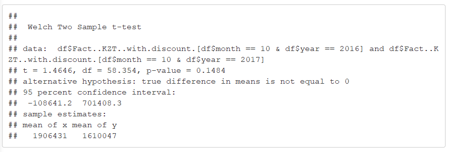
T-test value equals t = 1.4646 and p value = 0.1484(148%) , which means that the biggest sale in October is completely is a chance, but it means we could increase profit in any month by recommendation wrote in conclusion.
x<- df %>% select(Fact..KZT..with.discount., month, year)%>%filter(month==3, year == 2016|year==2017)
fligner.test(Fact..KZT..with.discount.~year, data=x)

By Fligner-Killeen test p-value = 0.879(88%), which means that the month with the highest profit is a combination of certain factors.
In conclusion: Amount of profit highly depend on 3 main Factors: month(seasonality), traffic of clients, Average item price
To increase profit by seasonality:
- Decrease the discounts to 20-40% during Autumn, Summer
- Increase productivity and work hours in those seasons
To increase profit by traffic of clients:
 - Make discounts only up to 50%
 - Advertisement during Spring and autumn
 - Increase quantity of hours of work during weekends
To increase profit by average item price:
- Make most of average item price 10000-20000, they have a huge probability of being sold